

This is the first blog post on 847. Written to help PowerApps Users who want more stylish Gallery Options.
Gallery items in Canvas Apps give developers an easy way customize how they want to display data. Below is an example gallery I made in a demo app that is getting its information from the “Contacts” Entity in the Common Data Service.
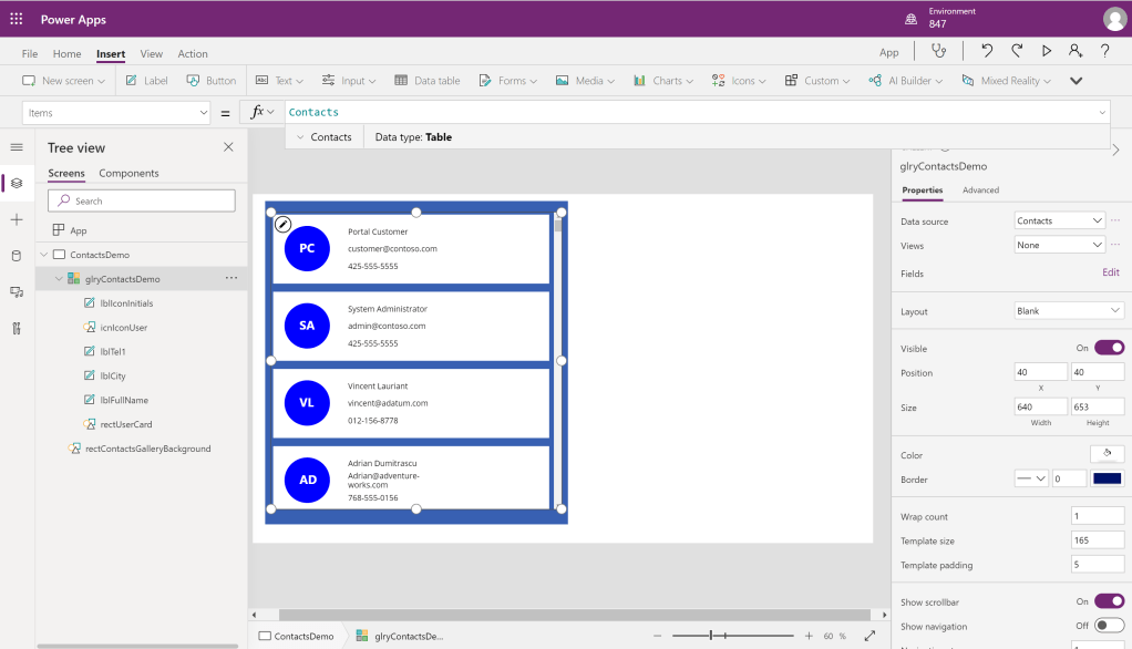
By clicking on the “Edit” button on the fields menu we can see what fields from the contact are being used to populate our gallery items.

Though the gallery item is very easy to use and customize, often developers want to extend it even further and develop a custom UI for viewing their galleries. This is what I was attempting to do when I ran into a blocker for being able to use different colored icons for my gallery items so that they would be easily differentiable. However, currently Canvas App does not offer any out of the box options for multi colored gallery item icons.
Below is my solution:
First, we have to add a color palette for our gallery icons, we can do this by adding color values to a table variable that we will initialize using the Set() function. Below I have only added 4; but the more colors that you add to your color palette, the better the randomization and color variation will be.

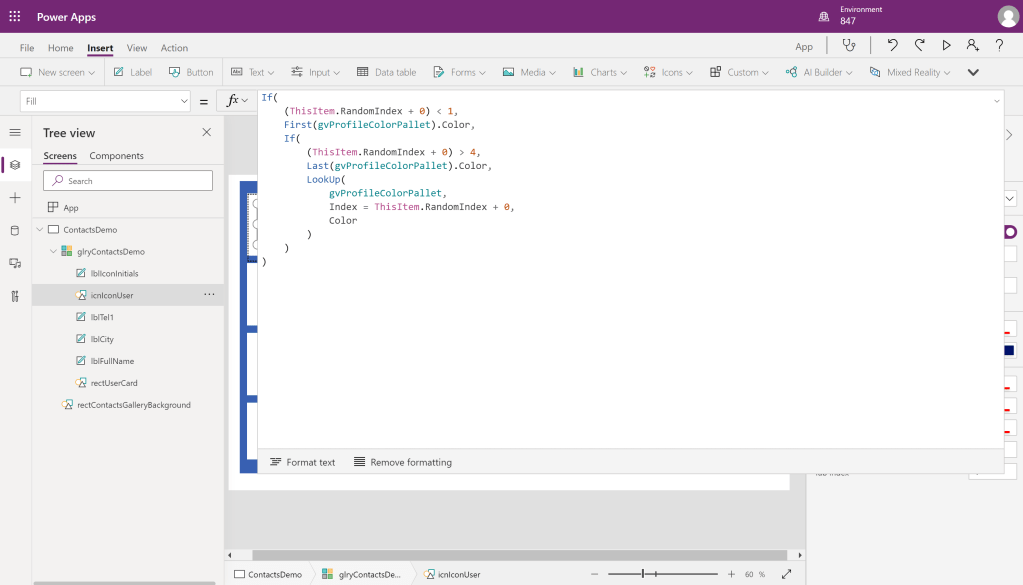
After this, we want to add a value to our data so that we can use this to reference our color palette selection. Here I am adding a column using the AddColumns() function, I am using 4 as a multiplier here due to there only being 4 colors in my palette.

Finally, we want to add code to our icon so we can display our random color. Here I am changing the fill on our circle Icon to display the first color in the pallet if the item has a random value less than 1 (our min), and the last color in our pallet if the item has a random value more than 4 (our max). Values in-between use the LookUp() function to get the appropriate color.
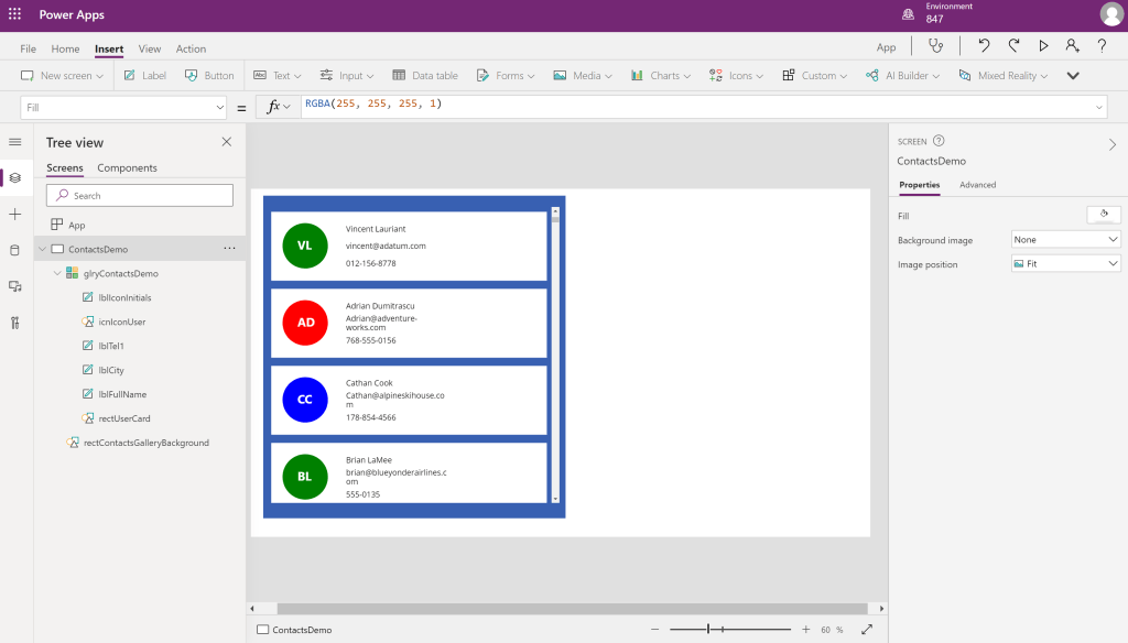
Finally here we have our finished product with different colored icons in the gallery!
 847 Tech