

Following up on my previous post about enhancing the UI for Canvas Apps in PowerApps, I was inspired by this post to make a tutorial for extending the remove functionality in PowerApps.
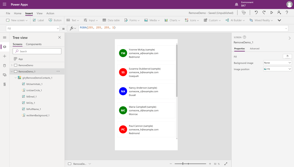
Here is where we left off on the previous post, in this example I am using the mobile template for apps but everything else is identical to the previous app. In this tutorial, we will be developing a solution that allows the user to select multiple contacts and be taken to a confirmation screen to confirm their choice to delete contacts.

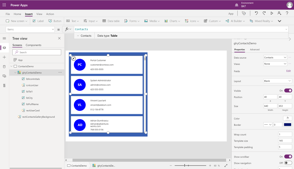
First, we will have to add a column to our table to keep track of which contacts we have selected. Here I am using AddColumns() to add “toBeDeleted” alongside “RandomIndex” (which is being used to set our color), and setting its default value to false.
In this app, we are using ClearCollect() to create a collection instead of adding a column directly on the Gallery Items. This is so that we can edit this data locally without having to update the backend data source. It is also currently not possible to create a collection within the Gallery Items section. After creating your collection, set your gallery items to the created collection.
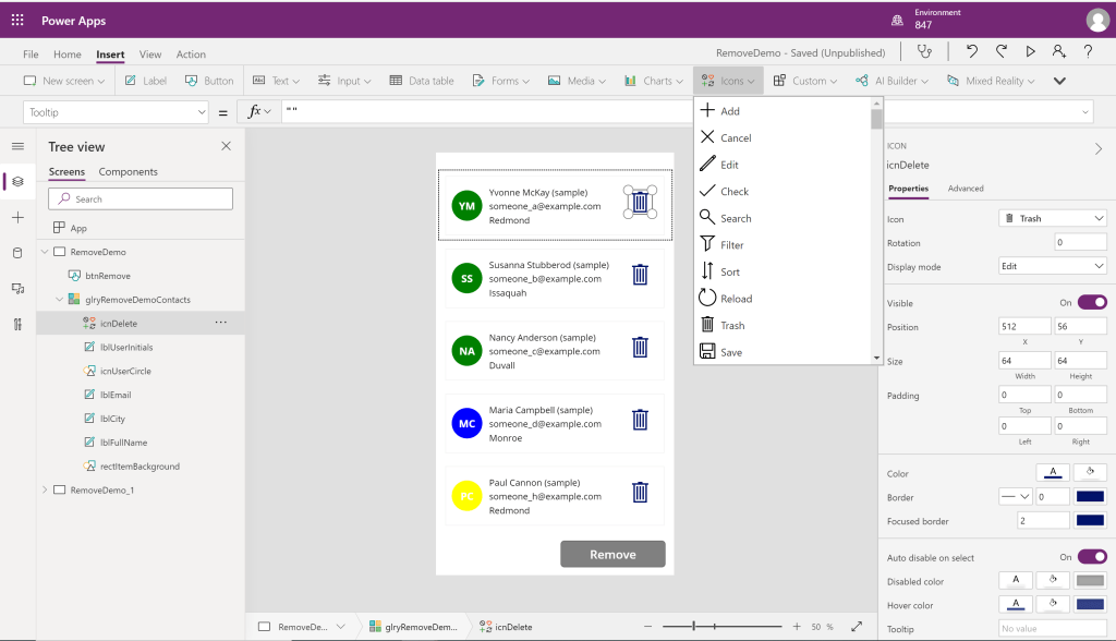
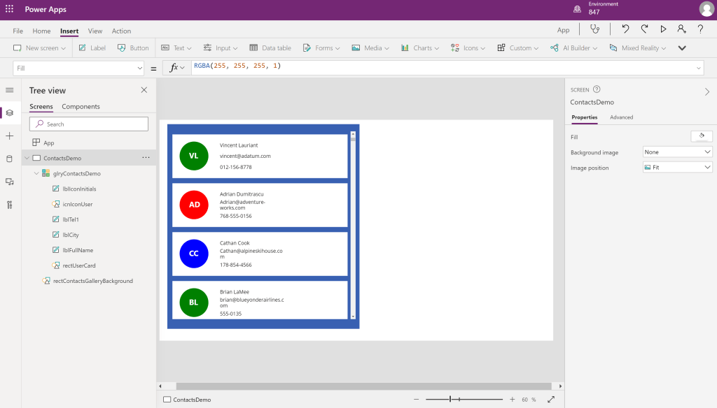
Next, we are going to add a trash icon to our gallery, this can be done by clicking inside a gallery item and selecting the “Icons” button on the top toolbar.
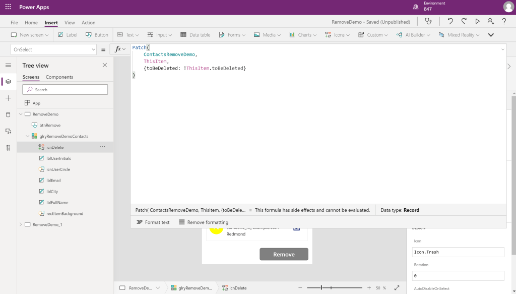
Inside our delete icon, we are going to first change the OnSelect() code to set the selected items value to the opposite of what it currently is on click of the icon.

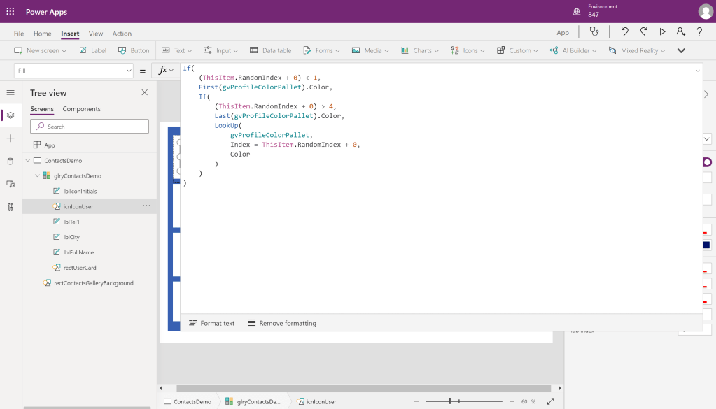
We are also going to add an if statement inside the icons color so that we can differentiate contacts that have been selected for removal.
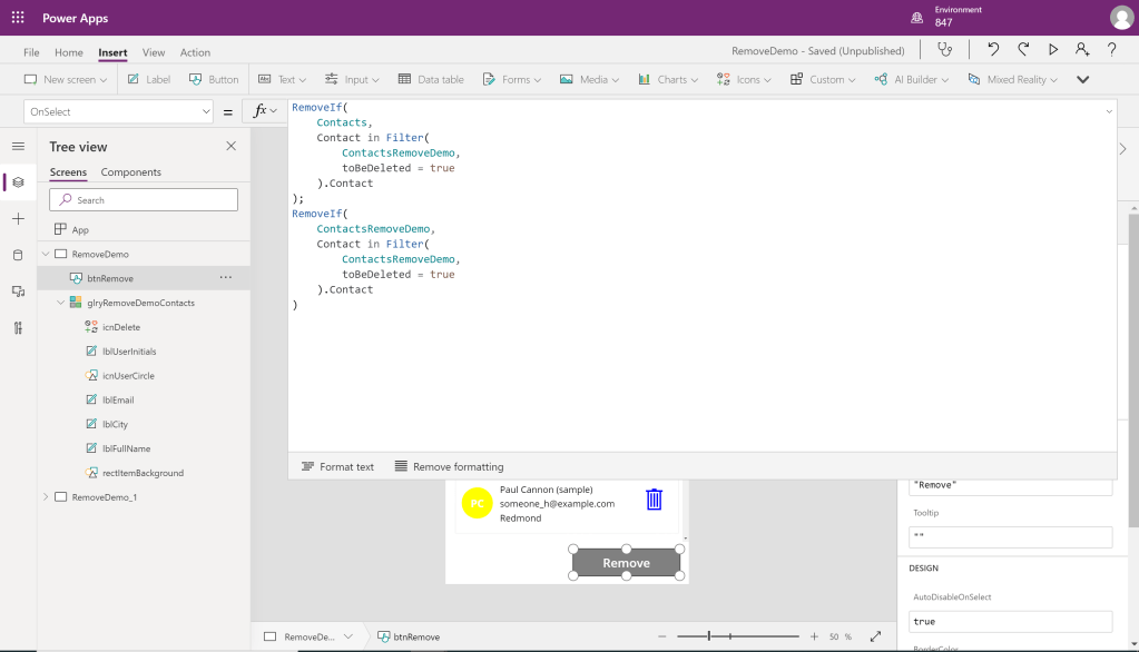
Finally, we can add our delete button, and fill in the following for OnSelect(). What our code is doing here is removing the record from the datasource as well as our local collection, records to be removed are determined by having a true “toBeDeleted” value.
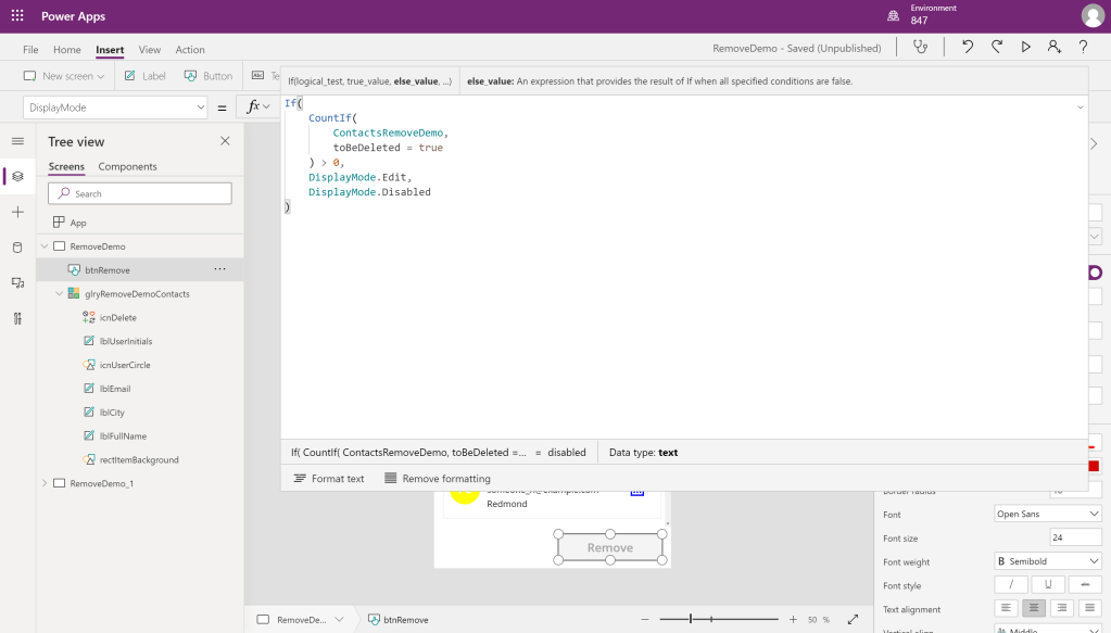
Here I added some code to disable the button if we do not have any members for removal. This disables the OnSelect() so that users do not mistakenly think they can remove members without selecting anyone to remove.

Here is an example of a confirmation screen you can create for deletion using this method.


 847 Tech